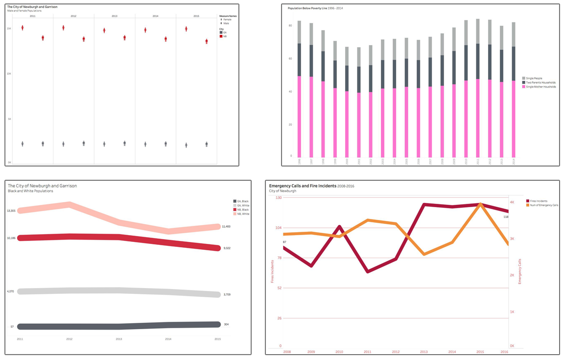
Newburgh NY Data Rift
I used Tableau to create a data set that backed up things that were said in a documentary I’m producing about Newburgh, NY. I found numbers that confirmed that circumstances were stacked against the people who lived there.
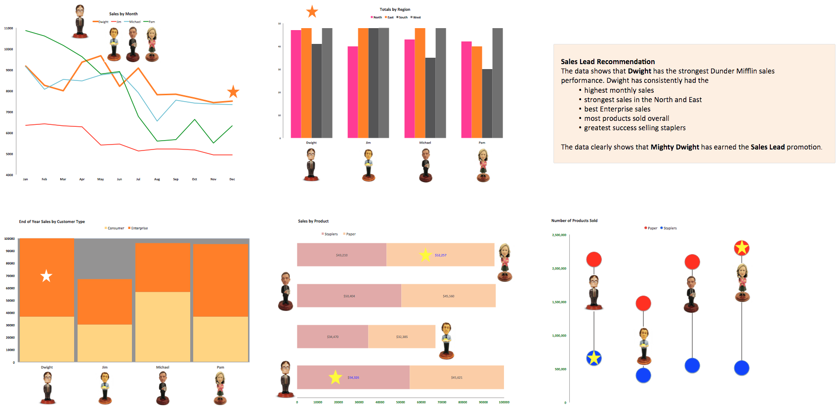
The Office Sales Lead
The project called for a clean and simple dashboard that analyzed EOY data and key metrics to help decide which sales team member deserves a promotion. Since the assignment’s fictional client was TV’s The Office, I used color and images to create a fun, informative experience.
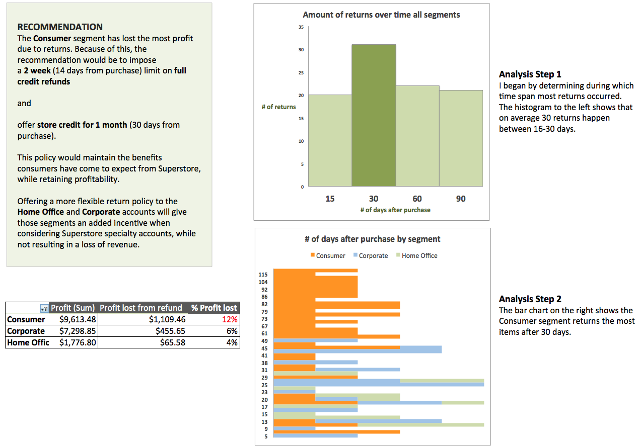
Analyzing Customer Returns
In this assignment, basic SQL writing and Excel formulas were used to advise a fictional retailer’s return policy. A histogram and a column chart display complex tabular data in a simple, clarifying analysis.
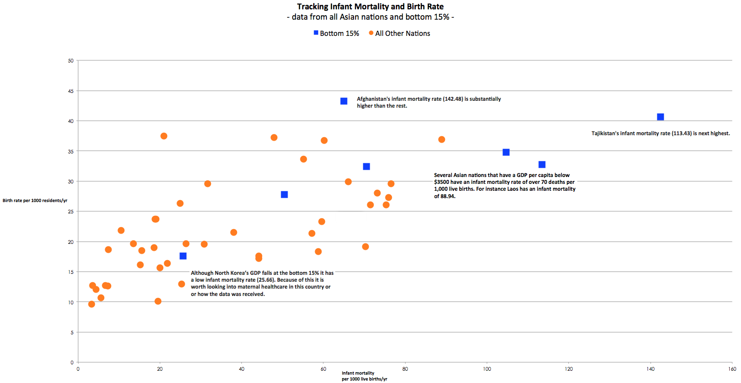
Allocating Relief Resources
Outliers reveal surprising insight that encourage further consideration. Here I discovered that a low GDP does not necessarily result in a high infant mortality rate. This may reveal a potential solution to the issue (or a problem with data collection). Exploring directions beyond the assignment’s framework increased my interest in data analysis.